
Problem
Joult Health's eligibility quiz is the primary conversion path from Facebook ads. Users were entering the funnel with high intent but not completing sign-up.
Impact
Drop-offs at multiple stages of the onboarding quiz were creating a gap between ad spend and actual conversions.
Executive Summary
This is not a redesign. This is a UX audit using MS Clarity session data and Claude to identify where and why users were dropping off in Jolt Health's multistep onboarding quiz.
Discovery
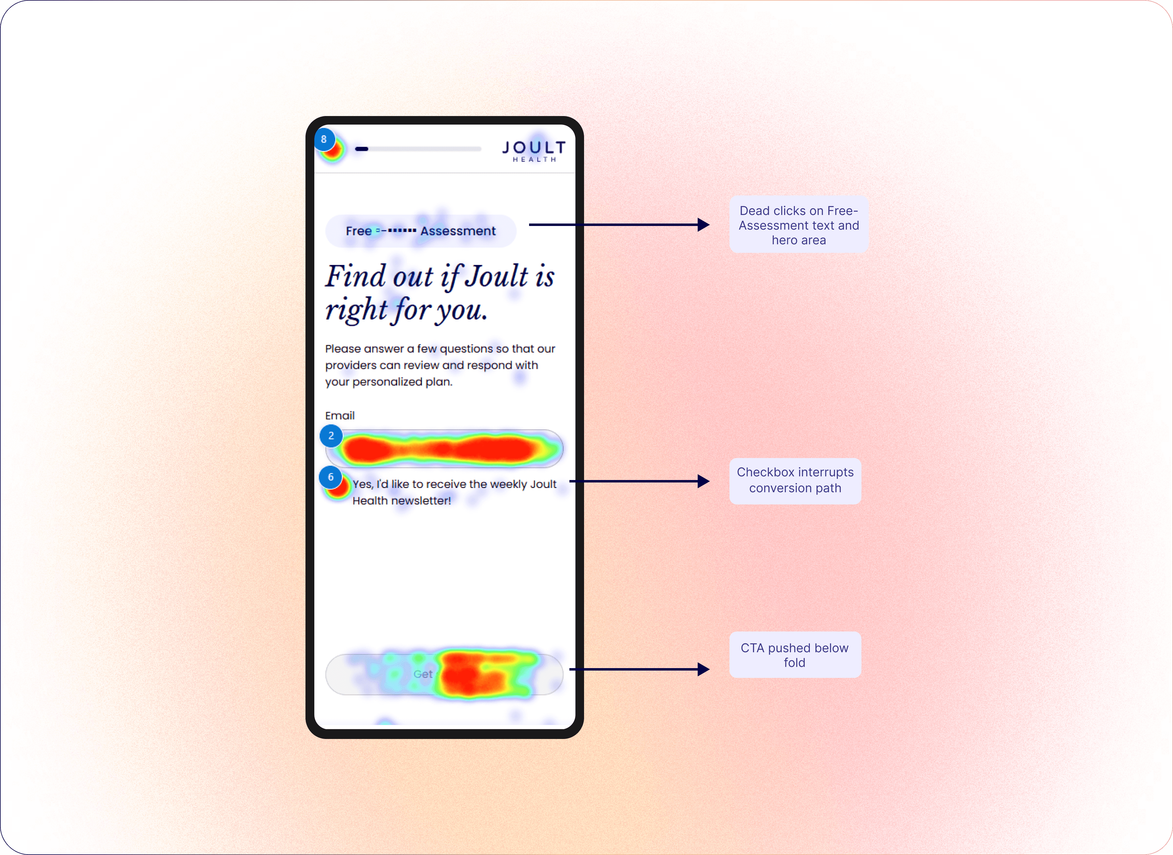
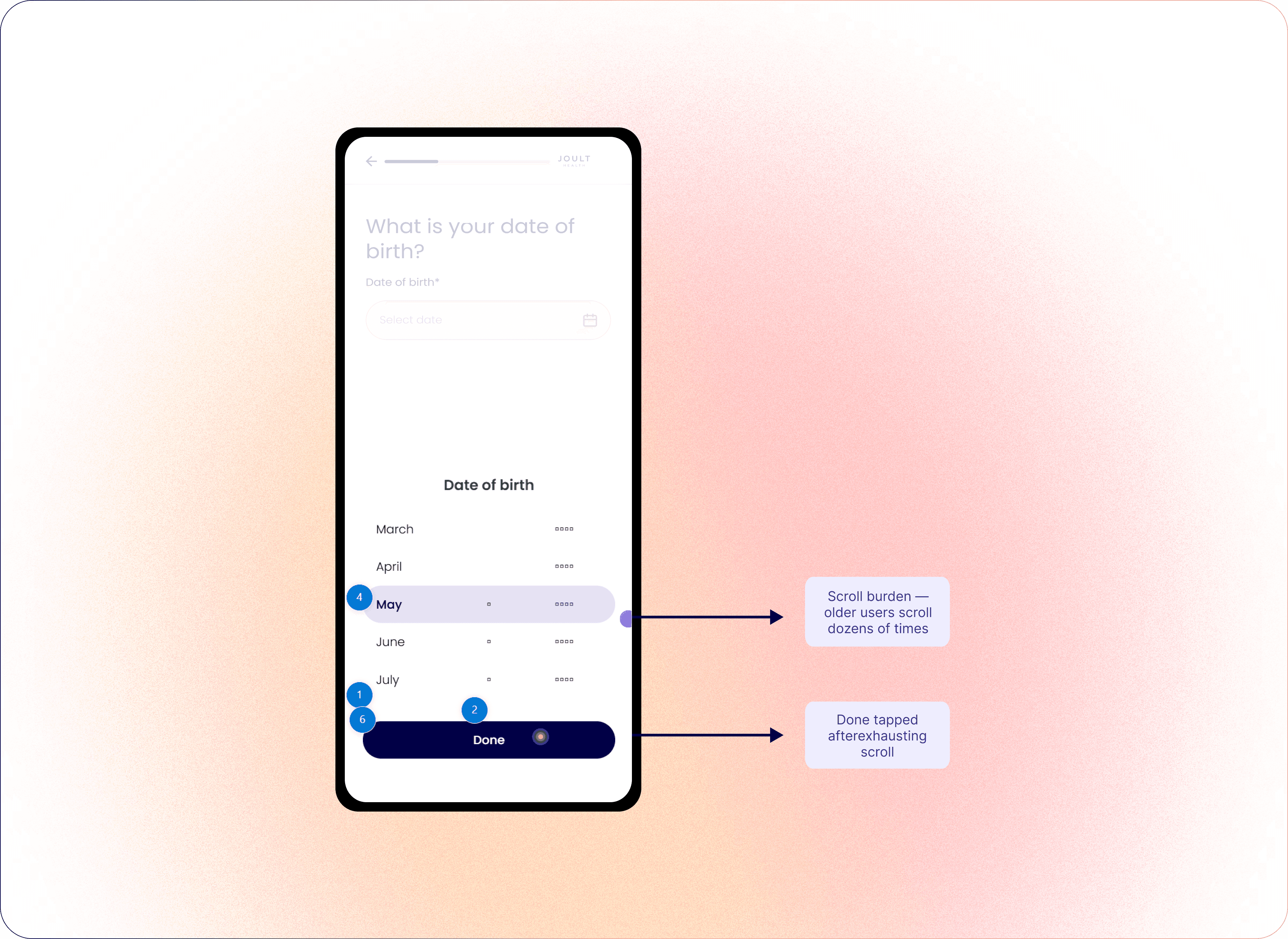
I analysed MS Clarity session data and mobile heatmap to identify friction patterns across the onboarding flow. Behavioural observations were then fed into Claude to synthesise findings and surface prioritised design recommendations.
Design Direction
1. CTA Invisibility at Quiz Entry
Mobile users tapped the Free Assessment label and non-interactive hero elements before locating the Get Started CTA. The Free Assessment label reads as a primary action, pulling attention away from the actual CTA.
Recommendation: Reduce the visual weight of the Free Assessment label so it does not compete with the primary CTA. Ensure Get Started is the only element that reads as a dominant interactive action on the page.
Outcomes
This audit produced a prioritised fix list:
Fix now. Reduce the Free Assessment label visual weight and replace the DOB drum picker. Both are causing abandonment before sign-up.
Next sprint. Redesign mobile hero CTA for visual dominance and introduce direct year input on the date picker.
Two A/B experiments were proposed to validate key recommendations with real traffic data.
Reflections
I fed behavioural observations into Claude and received a structured audit, complete with issue severity classification, UX principles, fix recommendations, and A/B test suggestions, in minutes. What would have taken hours of manual synthesis was done faster and with more rigour. This workflow is now part of how I approach any UX audit.